How Wiipo Reached Its First Million Registered Users in 2 Years
A case study on the creation of a new product and the exponential growth of users and business.


In its three years of existence, Wiipo has evolved from being a simple one-button app to becoming a valuable solution for employees across Brazil. By 2023, the Wiipo app has over 1.3 million registered users and has processed more than 1 billion in transactions.
To honor my non-disclosure agreement, I have omitted confidential information in this case study. All the information provided is authored by me and does not necessarily reflect the opinion of Wiipo or Grupo Senior Sistemas.
START

Employees using Wiipo can access payroll data, credit requests, and now benefits and agreements directly through the app. With everything integrated—salary and benefits—the app increases the perceived value of employee compensation, making it an excellent incentive for both employees and HR teams.
Wiipo is a fintech company with a mission to provide businesses and individuals with a new experience in consuming financial services and benefits, offering freedom and choice. It was acquired by Senior Sistemas in 2020 to enhance user experience by adding new services. Senior, as a leading tech company processing over 20% of payrolls in Brazil, had always aimed to expand user benefits.
CONTEXT
In 2021, Wiipo, as part of Senior Sistemas, made its first acquisition by purchasing Convenix, a startup specializing in benefits management.
Following this acquisition, there was a need to build a more robust app that delivered greater value to employees in their daily lives. Flexible benefits adoption grew from 26% of companies in 2021 to 44% in 2022, according to a CNN-published survey.
To remain competitive, Wiipo introduced the Wiipo Flex card following the acquisition. This card combines traditional benefits linked to Brazil’s Worker Food Program (PAT) with new options like home office and mobility allowances, offering employees the flexibility they need.
The Wiipo Flex product is built on the concept of simplicity and flexibility. It allows users to allocate funds between different benefit categories as they wish. This transforms the card into more than just a meal or food allowance card—it can also be used as a credit card when transferring funds to the free-use wallet. Additionally, the solution provides seamless integration and automation with major payroll systems, simplifying life for HR teams and employees alike.

Senior Systems Management, Wiipo Management, and Founders of Convenix.
THE CHALLENGE
When it comes to benefits, Wiipo competes with open-network players like Caju and Flash and closed-network giants such as Alelo, Sodexo, Ticket, and VR. The benefits market serves approximately 20 million customers, of which the major players dominate almost 15 million.
Our stakeholder interviews revealed growing dissatisfaction among HR professionals with the processes and limited solutions offered by closed-network providers. Many HR teams expressed concerns about the quality of service from closed networks but hesitated to switch to open-network solutions due to the fear of losing the "rebate" benefit. The rebate is a practice where traditional benefit card providers offer a cashback-like discount of 1% to 3% of the transacted amount, refunded to the contracting company

This led to one of our main challenges: how to deliver a product that provides value equal to or greater than the rebate for companies.

1. Making It Fast and Easy to Use for Everyone, Everywhere
A product designed to serve countless companies across the country must be quick, intuitive, and accessible to everyone—from a 16-year-old intern to seasoned professionals of various roles and skill levels. The goal was to provide a clear and practical overview of user transactions.

2. Giving Users More Control Over Their Money
The solution aimed to consolidate all employee benefits offered by a company onto a single card, granting employees the freedom to manage their own benefits as they see fit.
Another challenge was navigating legislative limitations tied to the autonomous solution we were offering. We aimed to build an initial version of the product that met the basic needs of both users and the business, all within a tight timeline to launch.
Our ambition was to better serve the thousands of clients already part of Senior’s network while seizing the opportunity to expand our offerings.
We needed to create a product that not only offered freedom in benefits management but also ensured security, privacy, and transparency. Since managing something as sensitive as employee benefits was involved, we were careful to clarify our high-level goals for this first version of the product:
3. Ensuring Security in User Transactions
Users could quickly access their recent transactions and benefit from robust security features, including options for blocking, unblocking, and resetting passwords in case of loss or theft.
MY ROLE
I joined the Wiipo product team in 2021 as the design lead for the new mobile product. Overseeing the design workflow and user experience for this project, I worked closely with a product team comprising two product managers and a CTO from 2021 to 2022.
We developed a plan to address both user and business pain points by mapping competitors, conducting user research to understand habits and preferences, and identifying user frustrations with competing products. Our ultimate goal was to create a solution that would inspire desire and stand out in the market.
In this case study, I’ll highlight key parts of this process and share the insights gained from the project's inception to the final delivery of its first version.
BUSINESS-FOCUSED APPROACH
One of the central user experiences we aimed to create was the feeling of freedom and autonomy in managing benefits. For this, we studied Brazil's Worker Food Program (PAT), which regulates food and meal allowance benefits.
Our research revealed that offering a flexible solution, like a free-use wallet, could lead to regulatory non-compliance if users were able to withdraw funds. Under PAT rules, withdrawing funds could reclassify the benefit as part of the monthly salary, potentially causing legal issues for companies.
We carefully considered these risks, analyzing how competitors managed similar challenges. The passing of Decree 10.854 on December 9, 2021, allowed for open networks, enabling cards to be accepted anywhere. However, the law required a portion of every recharge to be allocated strictly for food use.
This insight led us to design a flexible yet compliant product architecture, ensuring users couldn't transfer regulated funds into other wallets while still enjoying the autonomy to manage other benefits.
STRUCTURE AND SYSTEM INTEGRATION
Our first step was meeting with stakeholders to define the requirements for integration with our partners. Key questions included:

How does transaction data flow from the merchant to the user’s app?
What technical needs must be met to enable integration?
Which features are vital versus trivial for launch?
These discussions resulted in a product structure based on APIs developed both internally and by our partners. This collaborative approach clarified timelines, resource needs, and mutual expectations for product delivery.

Armed with a clear architecture, we then analyzed market standards to identify vital features for a seamless and secure user experience.
KNOWING THE COMPETITION
We conducted a comprehensive competitor analysis, examining major players like Alelo, Flash Benefícios, and Caju, as well as other financial or benefits-focused apps.
This benchmarking process included:
-
Comparing user interface layouts and available features.
-
Measuring how frequently key information was displayed.
-
Assessing the usability of features and how benefits were offered.
The insights gained from this analysis informed the development of a product that could stand out while addressing gaps and frustrations in the market.


Benchmark - Some information was hidden and others were reduced for the case.
In the competitor analysis, we measured the frequency with which certain information was presented, the types of benefit products offered, and how they were delivered. We also assessed the features available as well as their usability.

Competitor analysis – Information reduced for the case.
WHAT INSIGHTS DID WE GAIN?
Common Practices
By mapping the features of each application, we averaged UI patterns across competitors to identify familiar design standards. This analysis revealed key functionalities that formed the baseline structure for a financial benefits product.

Data synthesis - Competitor analysis – Information reduced for the case.
GETTING TO KNOW THE USERS
Working with the Product Manager and the UX Coordinator from Senior Sistemas, we developed an interview script to guide our user research.
-
Participants: We interviewed 45 people (15 per interviewer), representing different roles, ages, and locations.
-
Goal: Understand user experiences, pain points, and needs throughout their professional journey with benefits products, both physical and digital.
-
Method: Online interviews conducted via email invitations. Each session lasted about 25 minutes with one or two professionals present.


What Users Told Us
Here are some notable quotes from the interviews:
Sometimes the transaction updates take too long. If they were real-time, I’d feel more secure. I often doubt if the balance is correct or just outdated...
- Usuário
The one I use now is great—easy to navigate with a clean design. But the one I used at my previous job was cluttered, and I couldn’t find anything...
- Usuário
I don’t use it much because the card isn’t accepted in many places. I mostly use it at grocery stores, which is limiting...
- Usuário
The app is straightforward and shows the information I need. I like knowing when my next benefit will be available...
- Usuário
KEY INSIGHTS GAINED
The Frustration of Limited Acceptance

-
57% of users are frustrated by the limited number of establishments accepting their benefit card.
Lack of variety among partner stores reduces the democratization of the benefit, leaving users dissatisfied
"Schrödinger's Balance" Problem

-
63% of users feel insecure about their balance when making purchases.
Users often find their balance doesn’t update in real time, causing embarrassment and fear of declined transactions.
Less Is More

-
38% of users expressed a preference for clean and minimalist designs.
Overly complex apps with too many exposed features or ads create confusion and frustration.
Irritation from Delays
-
41% of users feel anxious due to slow app performance.
Delays or errors when checking balance during purchases lead to dissatisfaction and impatience.
SITEMAP DEVELOPMENT
We compiled the data gathered during research and created a sitemap for the product's first version.
Collaboration and Techniques
-
Worked closely with the tech team, using methodologies such as Impact vs. Effort, Now, Next & Later, and Dot Voting to prioritize features.
-
Collaborated with commercial and customer success teams through sessions focusing on Impact vs. Effort.

WIREFRAMES
Version 1 (V1)
To align with the expected launch timeline, we opted for a more conservative structure that repeated itself throughout the user journey. This approach allowed us to deliver all necessary information with a pleasant and familiar layout, minimizing development effort.

Structure of instructional screens
- Card activation journey

Structure of password creation screens
- Card activation journey

Structure of password creation screens
- Card activation journey
UI RESULTS
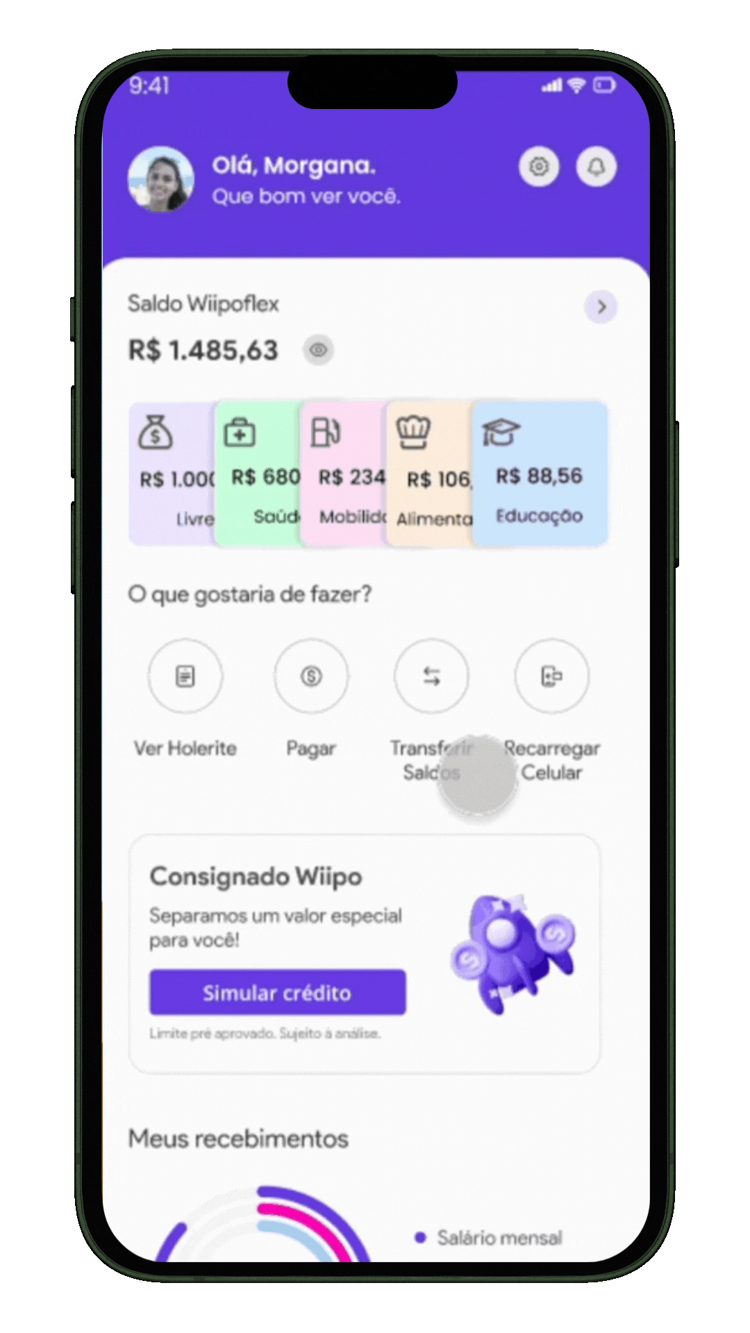
Quick Access to Wallets
We placed the wallets on the app's home screen to ensure quick access to balances, particularly during purchase moments.
-
The recording on the side demonstrates the process of transferring balances between wallets.
-
Users can transfer balances either within the same wallet or directly from the app’s home screen.

WIIPOFLEX AREA
Card Features
The card section allows users to:
-
Access virtual cards
-
Pay bills
-
Transfer balances
-
View expenses via statements
Future Evolution
-
The "Block" button will evolve into a "Security" section, offering more configuration options and simplifying processes.
-
For added simplicity, no password is required for transactions in regular wallets. However, transfers from the "Free" and "Withdrawal" wallets will require a password for security.
WALLETS
Category-Specific Wallets
We created wallets for ten categories, each allowing users to see establishments where the category applies. This ensures that each transfer aligns with the user’s intended transaction.
Enhanced Control
-
Users can view individual statements per wallet, providing better control over spending by category.
-
When transferring from a specific wallet, the transfer journey is streamlined, as the source wallet is pre-selected.

CARD ACTIVATION


A Key User Journey
The Card Activation flow was deemed essential for the initial launch. This process occurs during the user’s first login after their company adopts the card.
-
Activation screens were designed to be instructional, as activating a benefit card differs from activating a traditional credit card.
